Mama & Hapa’s Zero Waste Shop


︎ E-commerce redesign of a Portland zero waste shop to enhance its online presence and empower new audiences in making the transition to sustainable alternative products. ︎
Challenge:
Zero waste is a lifestyle and a set of practices aimed at reducing the amount of waste sent to landfills to as close to zero as possible. The existing website is difficult to navigate and doesn’t reflect the innovation and unique experience offered in store. As the business scales up their online and delivery efforts, users need a more intuitive and pleasant experience in making purchasing decisions.
Solution:
The redesign offers an intuitive navigation system, beginner resources, product subscriptions, transparent source labeling, and an easy pick-up experience. The shopping experience is made to be informative and user-friendly, encouraging the sustainable lifestyle while building trust with their audiences.
Role:
UI/UX Designer
Timeline:
2 weeks
Responsibilities:
Market Research / Information Architecture / Qualitative User Research / Persona Development / UX/UI / Prototyping / Usability Testing
UX Framework
Phase 1:
Research
Market Research
Research
& Synthesis
Market Research
Heuristic Evaluation
Information Architecture
User Research
Persona User Stories
Phase 2:
Define, Design
Problem Statement
Define, Design
& Test
Problem Statement
Concept Modeling
User Flows, Wireflows, Wireframes
Usability Testing
Style Guide
Phase 1: Research & Synthesis
Competitive Analysis & Heuristic Evaluation
Understanding the brand’s positioning.
To gain a comprehensive understanding of the brand’s position within the local competitive space, as well as a wider market space, I performed competitive & comparative analyses on local sustainable brands and brands from different industries who apply similar approaches and values.

Key Takeaways: Competitive Analysis
- Balance of simplicity and information.
- Accessible purchase points throughout.
- Build trust through aligned values.
Key Priorities: Heuristic Evaluation
- Lack of messaging hierarchy.
- Lack of style consistency in components and typography throughout.
- Unorganized navigation.
- Lack of visual satisfaction.


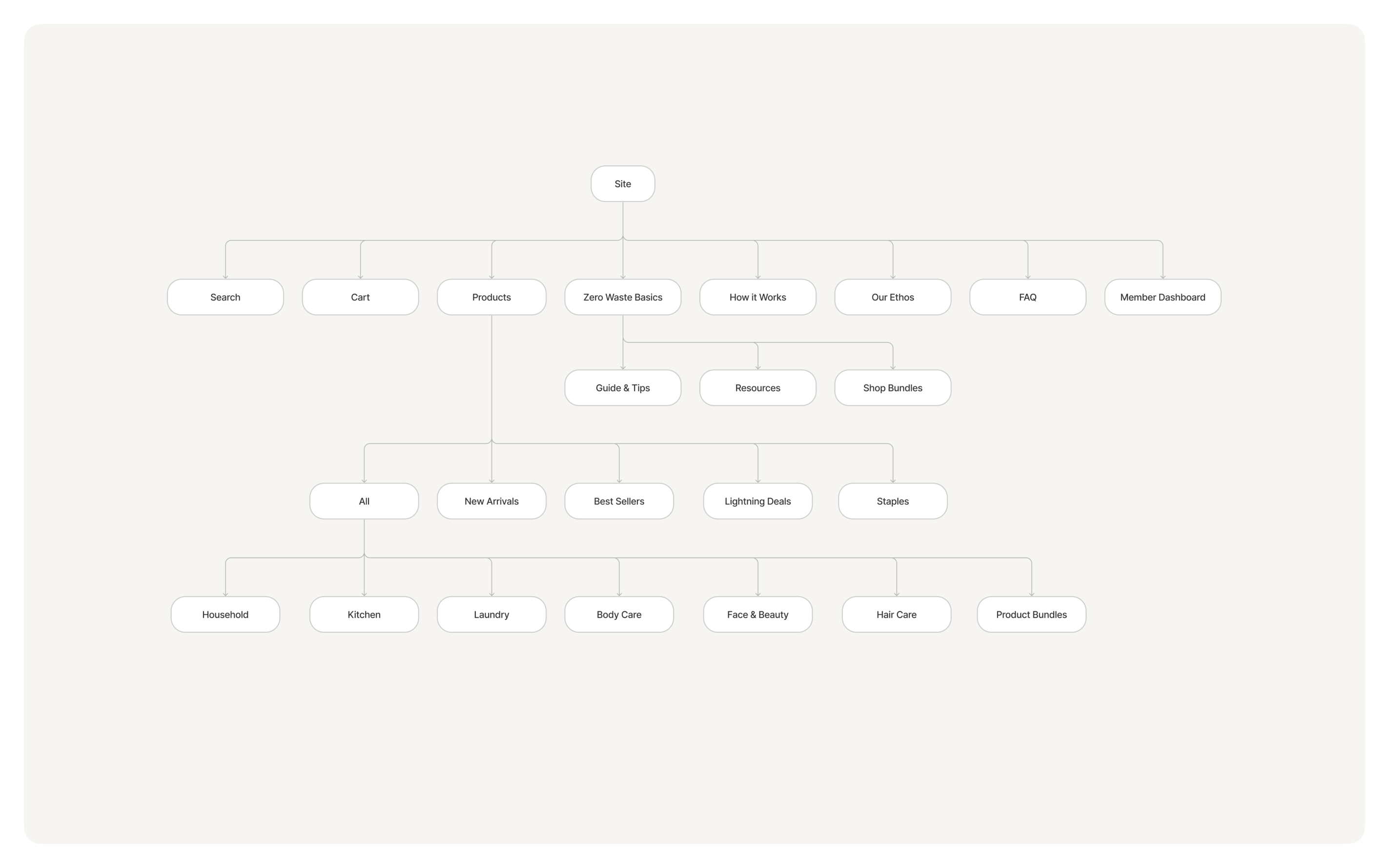
Information Architecture
Performing card sorts to create the site map.
I gathered 4 users to organize the website content into categories that make sense to them. I identified patterns in how users perceived and prioritized the given information, leading to an effective site map that reflects the website’s information architecture, ensuring that users can easily find what they need.

User Interviews
Discovering user needs & empathizing
Discovering user needs & empathizing
with our target audience.
I spoke with 6 users with various sustainability commitments and knowledge. I aimed to understand their needs and frustrations related to the existing infrastructure and their experience with current systems.
3 users living an active eco-conscious lifestyle.
3 users unfamiliar with zero waste.
Insights
- Users don’t easily trust information found online and perform extensive research to cross check ingredients and sources before making a purchasing decision.
“ I always do my own research when shopping whether in store or online. I read everything, description, uses, ingredients.”
- New users find it hard to hold themselves accountable and overcome old habits. It takes a lot of conscious effort and failures to tune the lifestyle to work for each individual.
“ The zero waste transition isn’t easy. It can be very overwhelming. It needs to work for the individual, so there’s a lot of flexibility. No one’s perfect.”
- Although users are highly motivated by helping the environment, they are also very cost-conscious. They seek discounts and programs to save money while doing good.
“Loyalty and reward programs drive me to buy more. It makes me feel good to get discounts every time I shop.”
- New users want more sustainable options, but don’t know where to start and how to evaluate products among the seas of options.

Persona Development
Primary & Secondary Personas
I wanted to focus on the primary persona, the “Eco Newbie” and tackle the barriers they face when breaking into this new journey.


Phase 2: Define, Design & Test
Problem Statement
Niko needs a way to find sustainable replacements for the products she uses currently because she wants to live a more eco-conscious lifestyle and reduce her waste.
Design
Ideation & Concept Modeling
Ideation & Concept Modeling
With a better understanding of the users, their needs and frustrations, I brainstormed potential solutions based on How Might We questions surrounding their painpoints.
Key Features
Trust
Efficiency
Resources
- Zero Waste Basics resources page.
- Quick Start, tried and tested product bundles.
Trust
- Verified labels displayed throughout.
Efficiency
- Product Quantity Calculator.

Design
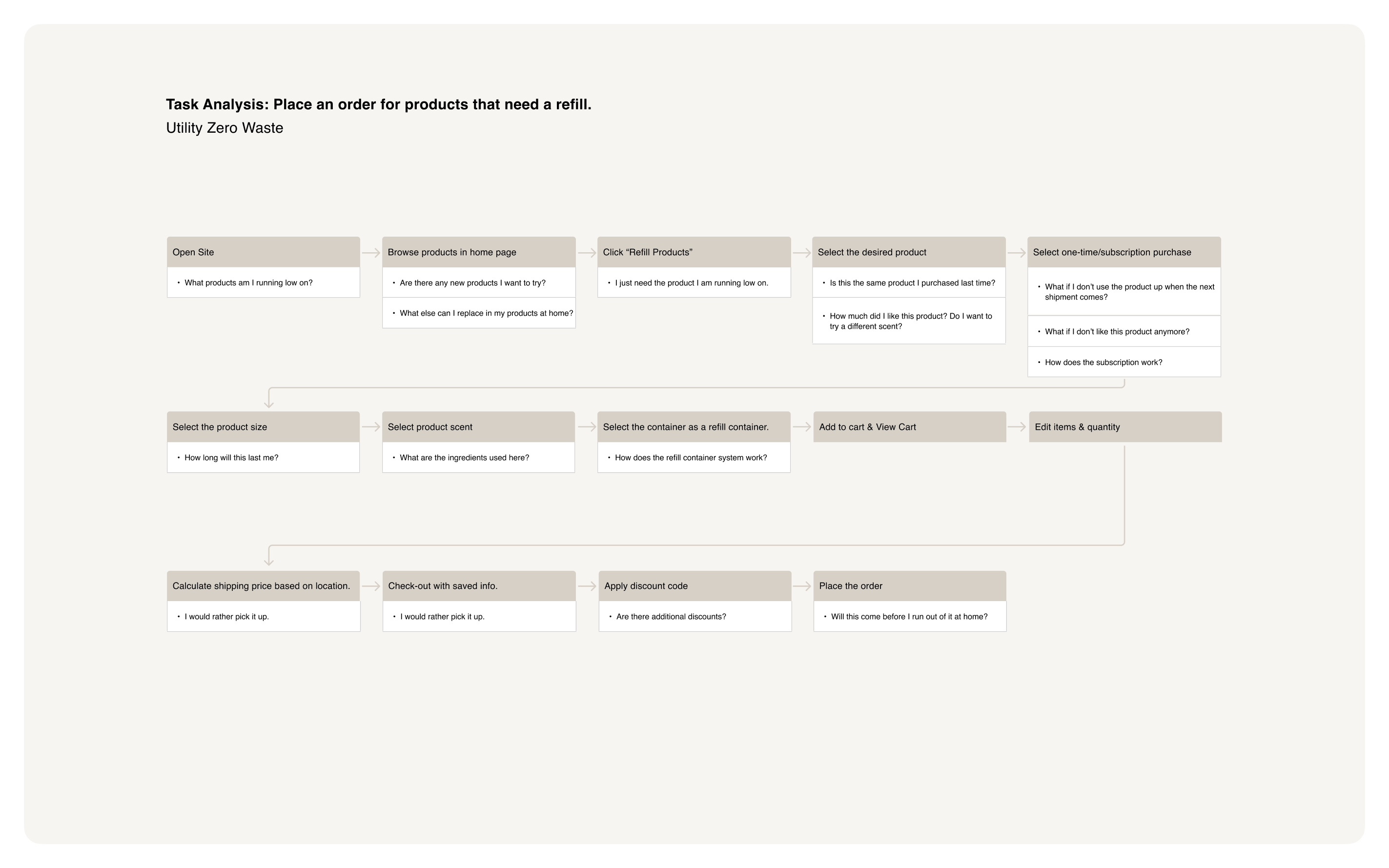
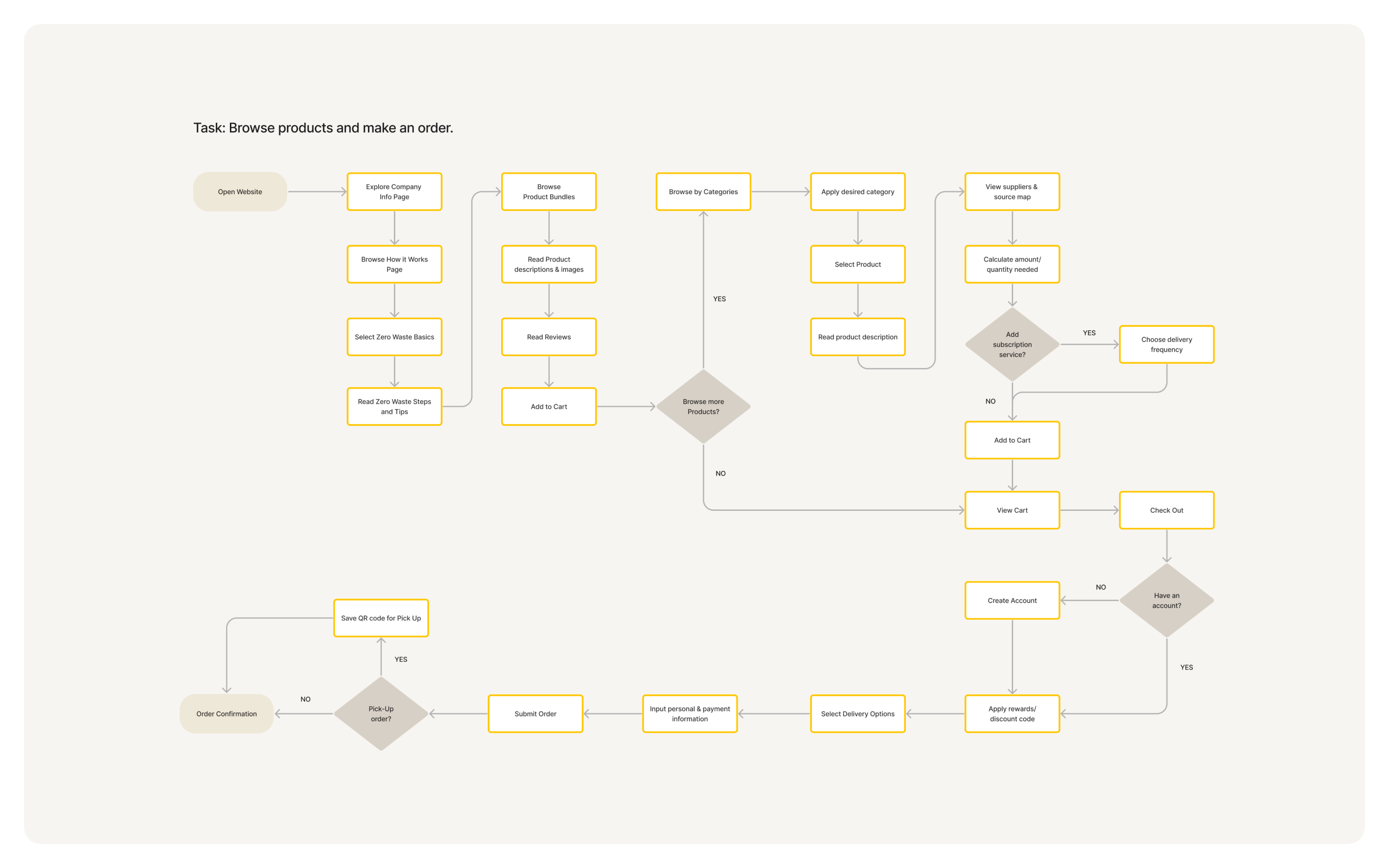
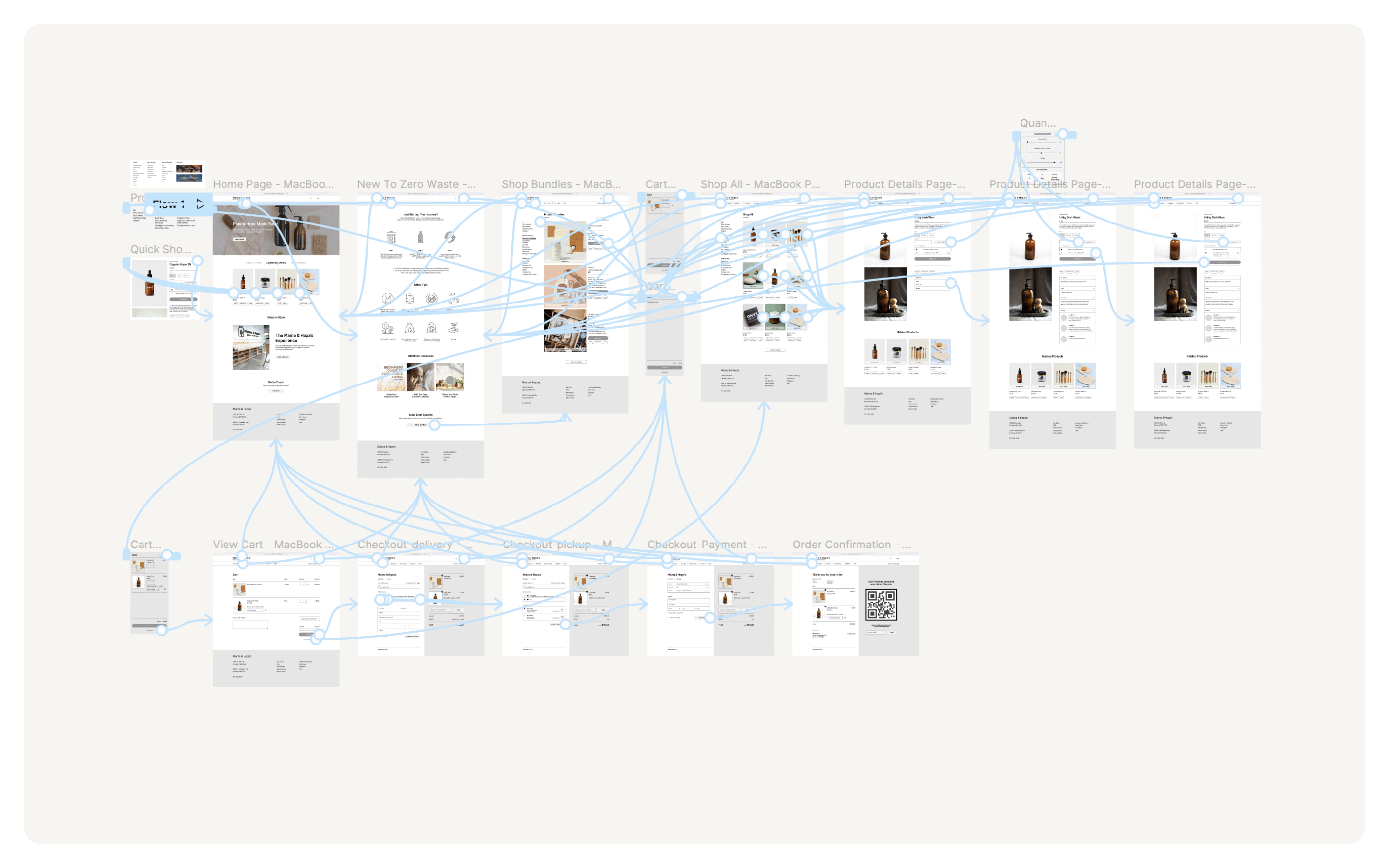
User Flows & Wireflows
Through many iterations of user flows and wireflows, I identified the most intuitive and logical navigation flow that implements the features and solves for my personas.
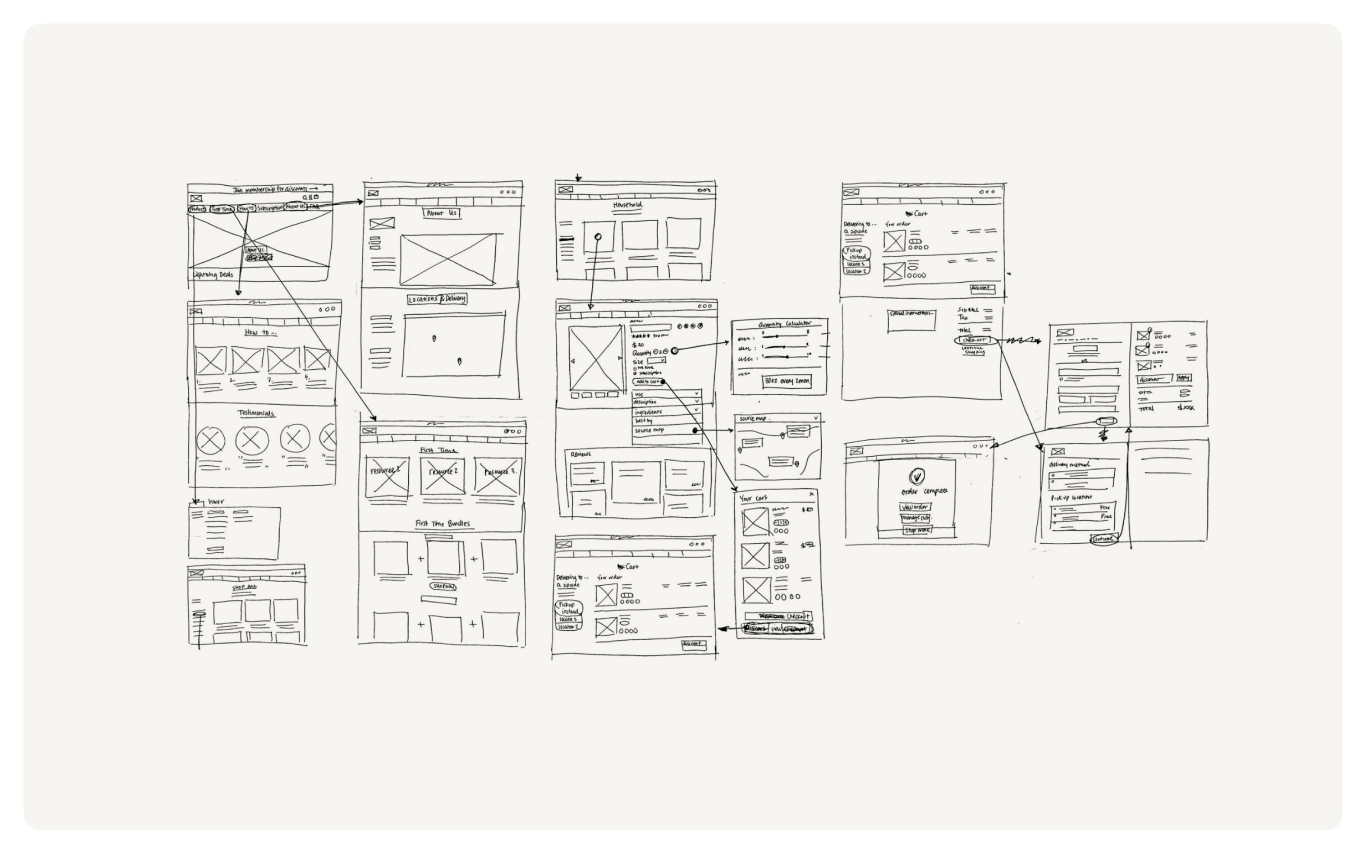
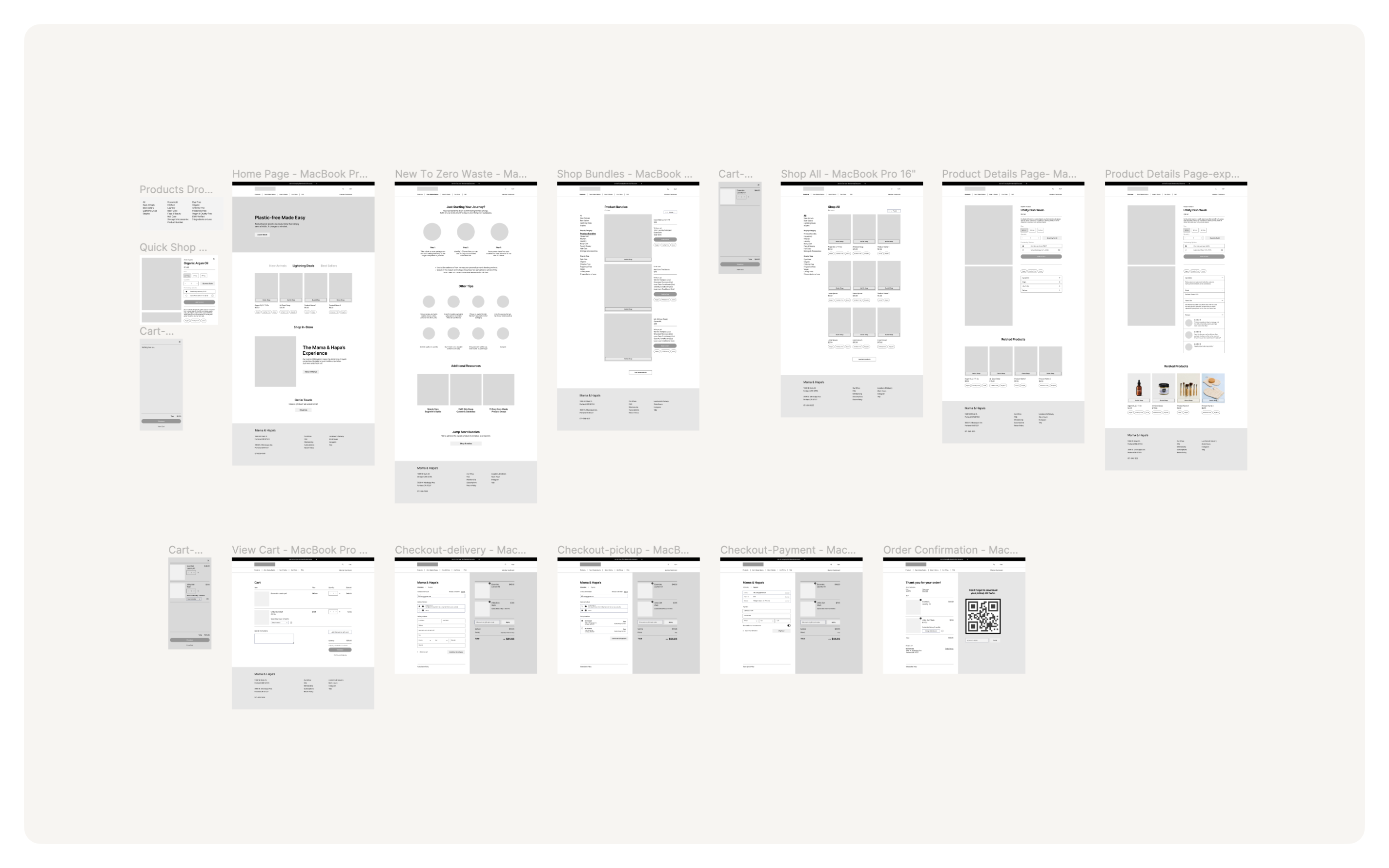
Wireframing
Low & High Fidelity Prototyping
Then I create wireframes to compose the structure of content in each screen and prototype the interactions for usability testing.
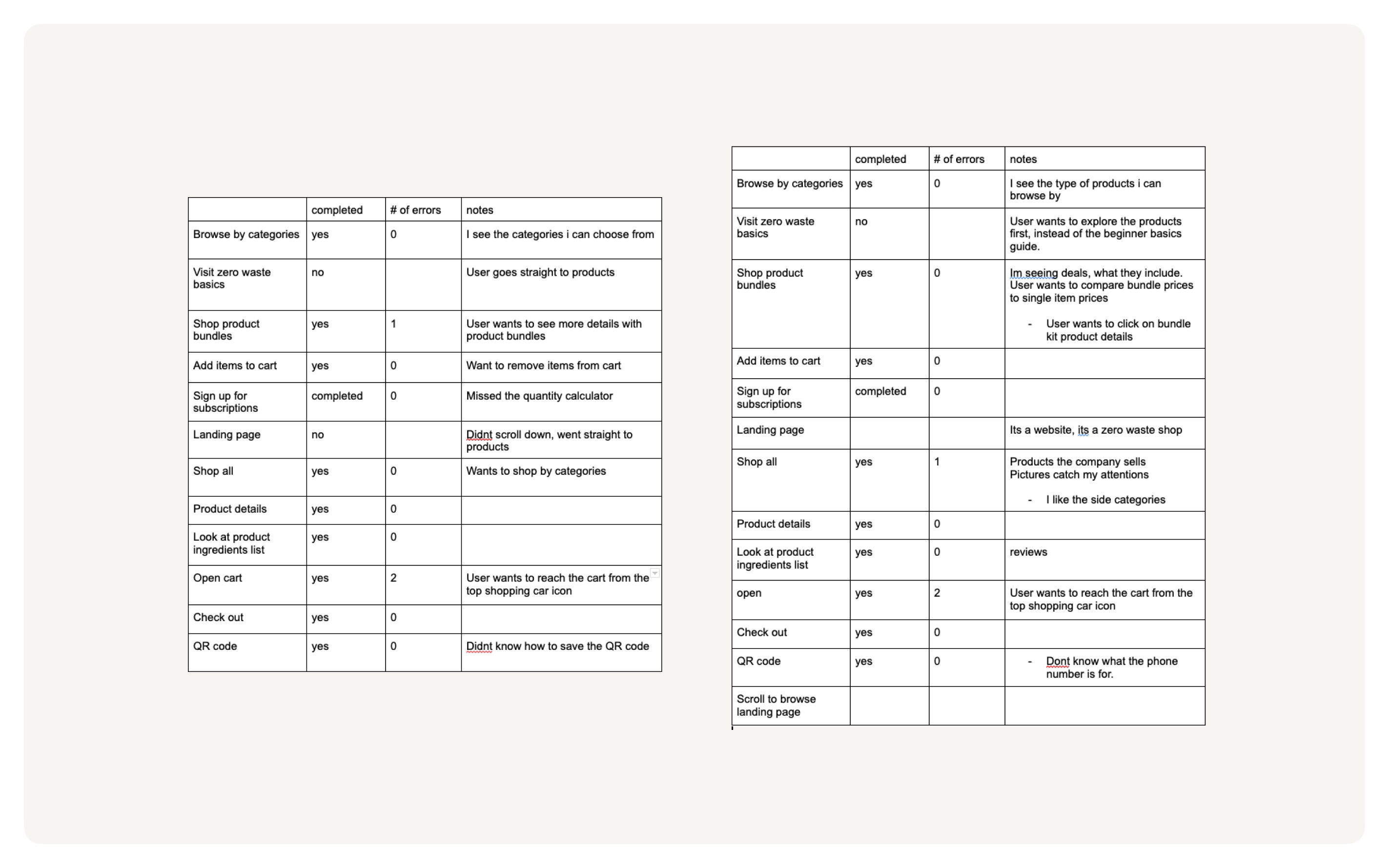
Usability Testing
Identifying usability issues & making informed revisions.
I performed 4 usability tests to identify areas of the design that can be improved and made revisions into the final prototype.
Findings
All users missed the Zero Waste Basics page.
3/4 users didn’t know how to save the QR code for pickup orders.
2/4 users wanted to compare product bundle prices to regular item prices.
Revisions
Move Zero Waste Basics page before products in primary nav.
Add copy for directions and how to use.
A breakdown of prices and compare feature for product bundles.
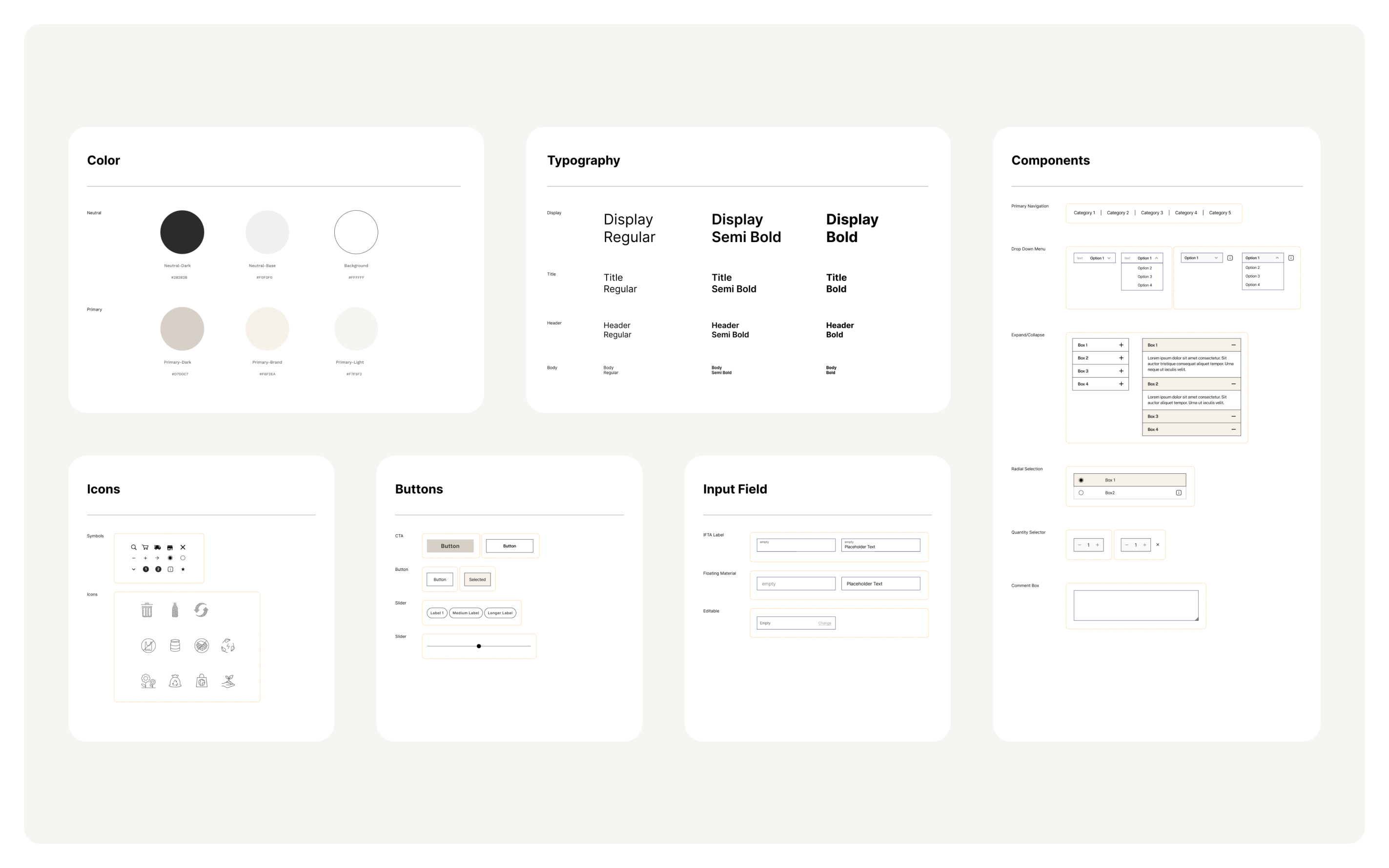
Brand & Visual Design
Creating the design system.
Creating the design system.
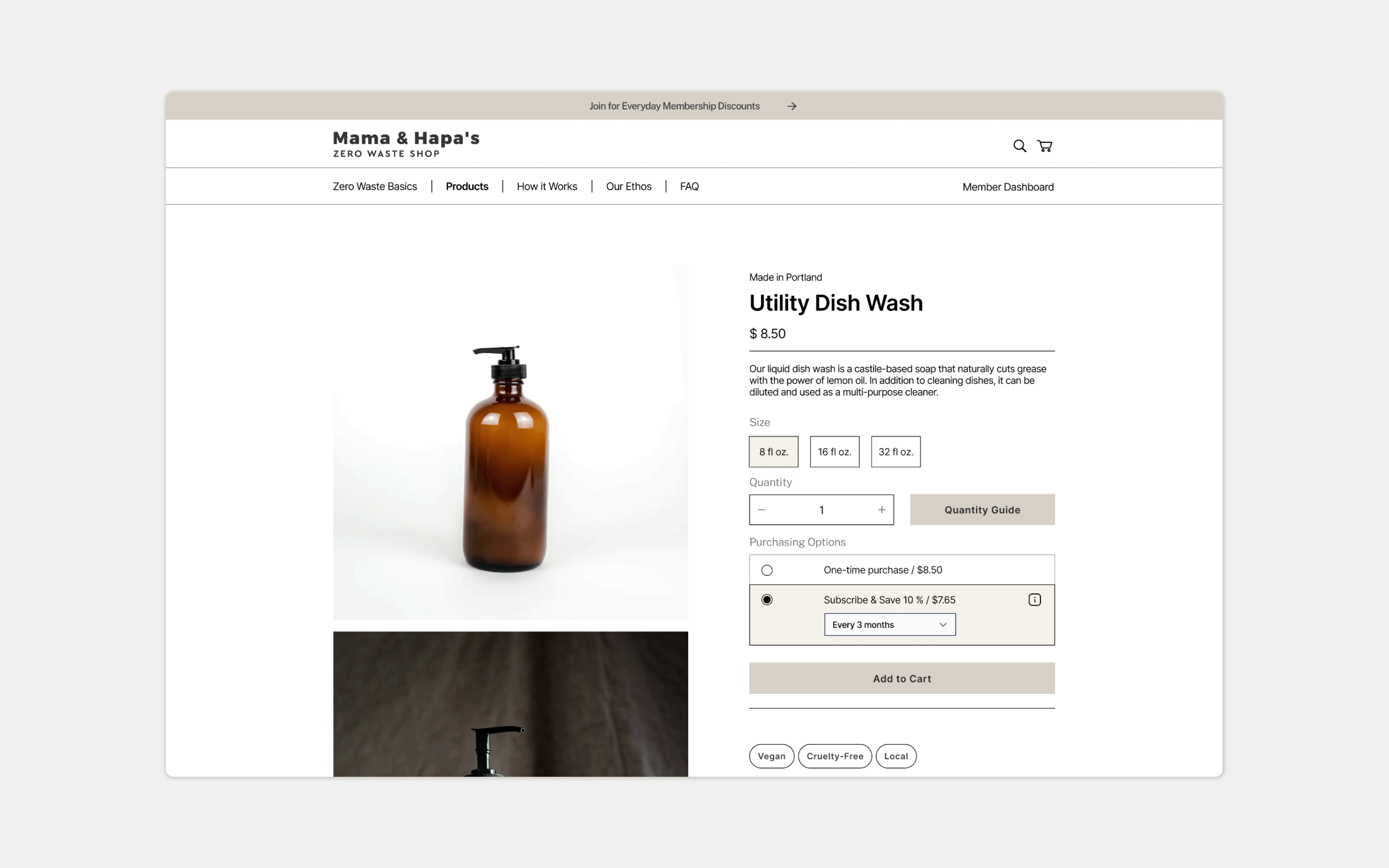
Final Design Prototype
Mama & Hapa’s Zero Waste Shop Redesign.
Mama & Hapa’s Zero Waste Shop Redesign.
Resources
Zero Waste Basics resources page.
Shop beginner “Quick Start” product bundles.
Trust
Verified labels displayed throughout.
Detailed & transparent product ingredients, sources, and reviews.
Resources
“How to Use” instructions for each product.
Convenience
Product Quantity Calculator.
Subscription Service.
Convenience
- Accessible check-out points.
- Pick-up QR code.
Next Steps