Version Comparison Tool - Guided Workflows

Guided Workflows
A low-code, node-based automation engine that enables teams to build logic-driven flowsthat streamline complex support workflows and scale customer operations with efficiency and consistency.
Overview
Transforming chaotic workflow changes into clarity, confidence, and control
As Guided Workflows became more widely adopted, users struggled to track, understand, and restore changes which created friction and slowed down error debugging for high-impact workflows.
I led the end-to-end design of Sprinklr’s first version comparison experience. I created a clear, integrated solution that helped teams identify changes with confidence. This work improved usability, reduced reliance on support, and established a scalable design pattern for versioning across the platform.
Role
Product Designer
Product Designer
Team
UX Researcher
Product Managers
Developers
UX Researcher
Product Managers
Developers
Timeline
6 weeks
6 weeks


Problem
Tracking workflow changes was manual, messy, and error-prone. When workflows break, teams are left in the dark
As Guided Workflow adoption grew, managing logic became harder. Without version tracking or visibility into changes, users struggled to debug issues, collaborate, and restore past configurations with confidence.

🙈 No visibility into changes
Users couldn’t see what had been edited, making debugging frustrating and error-prone.
🤔 Unclear Ownership
Teams were left guessing who made updates, complicating collaboration and accountability
⏳ High risk of rework
Restoring a past version could accidentally overwrite important changes—creating more problems than it solved.
Goal & Challenge
Make workflow changes easier to manage at scale
Our goal was to help teams spend less time debugging and more time building. Users needed a clear way to see what changed, who made the change, and when, without relying on support or digging through logs. We wanted to bring more clarity and confidence to how people manage workflows day to day.
The challenge? Creating clarity in a complex, unstandardized system
There was no existing pattern to build from. Workflows could get huge, with hundreds of nodes, and version history tools in the platform were outdated and inconsistent. We had to design a solution from the ground up that felt simple, worked across all types of modules, and could scale for future needs.
Current Implementations

Key UX Flows
Breaking down complexity into actionable flows
To design a seamless and scalable version comparison experience, I defined three core flows—each solving a critical user pain point and forming the foundation for a cohesive, end-to-end solution.
1. Navigation & Entry
Unified access to version history, comparison, and restoration in one intuitive entry point.
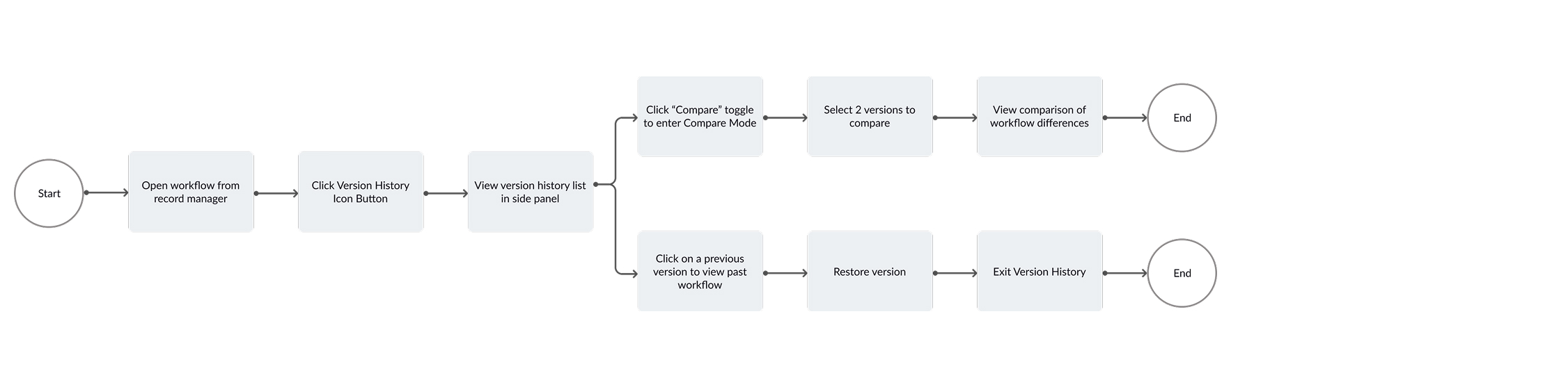
2. Workflow Comparison
Highlights major structural changes across nodes without overwhelming the interface.

3. Node Properties Comparison
Compare granular edits within nodes to help users clearly understand what changed.

Design Process
Working closely with the team, we made thoughtful trade-offs on design explorations to keep the experience usable, scalable, and realistic to build.
![]()

Flow 1.
Navigation & Entry
Making version comparison discoverable, integrated, and scalable
Challenge
Low Discoverability
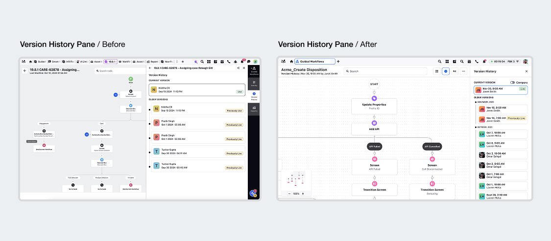
Access to version history was hidden and fragmented. This made it hard to discover, hard to use, and impossible to scale. I needed to consolidate version tracking, comparison, and restoration into one clear, accessible flow.
Access to version history was hidden and fragmented. This made it hard to discover, hard to use, and impossible to scale. I needed to consolidate version tracking, comparison, and restoration into one clear, accessible flow.
Solution
We unified version tracking, comparison, and restoration into a single, accessible entry point within the workflow builder.

By updating existing components and interaction patterns, we created a scalable model for selecting and comparing versions without disrupting user context. While also ensuring consistency across future implementations of version history throughout the platform.


By updating existing components and interaction patterns, we created a scalable model for selecting and comparing versions without disrupting user context. While also ensuring consistency across future implementations of version history throughout the platform.
Flow 2.
Workflow Comparison
Helping users spot meaningful workflow changes without overwhelming them
Challenge 1
Workflow Complexity
Workflows could contain hundreds of nodes with structural changes like additions, deletions, and movements. Users needed a way to compare versions without getting lost in complexity.
Workflows could contain hundreds of nodes with structural changes like additions, deletions, and movements. Users needed a way to compare versions without getting lost in complexity.
Solution
We explored both a combined inline view and side-by-side view to evaluate usability, scalability, and dev feasibility.
![]()
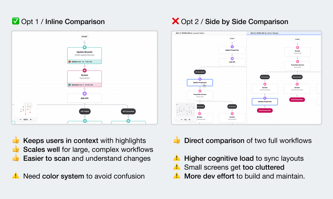
The combined inline comparison view allowed users to stay within one canvas, scan changes in context, and avoid friction of navigating two separate canvases.
Challenge 2
Reducing visual noise with color
Our initial approach and PM/dev suggestion used five color indicators for different change types, which quickly became overwhelming especially in dense workflows.
Our initial approach and PM/dev suggestion used five color indicators for different change types, which quickly became overwhelming especially in dense workflows.
Solution
We streamlined the color system to just 2 key colors to indicate nodes that were added, removed, edited, or moved.
![]()
This reduced cognitive load and helped users focus on the most important changes.
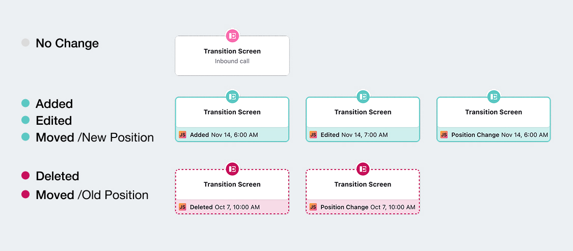
This reduced cognitive load and helped users focus on the most important changes.
Flow 3.
Node Properties Comparison
Making detailed changes easy to identify without cluttering the workflow
Challenge
Granular Comparison
Users also needed to see detailed changes at the node configuration level. This required designing for multiple levels of depth without overwhelming the interface.
Users also needed to see detailed changes at the node configuration level. This required designing for multiple levels of depth without overwhelming the interface.
Solution
We explored 3 patterns: a side pane, a popover, and a modal.

We chose the side pane because it let users view detailed node changes without losing sight of the overall workflow. Keeping the canvas visible made it easier to understand what changed and how it fit into the broader logic, reducing mental load and improving clarity.
Outcome
A clearer, more scalable way to manage workflow changes
The version comparison experience introduced meaningful improvements across both user experience and platform consistency:
✔️ Improved usability
Users could now easily identify what changed, who made the change, and when—without needing to leave the workflow or rely on support teams
✔️ Faster debugging
Combined view and simplified color highlights helped teams quickly scan and troubleshoot changes, even in complex workflows
✔️ Reduced support dependency
By surfacing changes clearly, the tool empowered non-technical users to self-serve, reducing escalations to technical teams.
✔️ Scalable design pattern
The version history components and side pane patterns were adopted by other product teams, establishing a reusable standard across Sprinklr.
✔️ Positive cross-functional feedback
PMs and engineers highlighted the clarity and flexibility of the final solution, enabling smoother rollouts and quicker adoption internally.
While full metrics are still being gathered post-launch, early feedback from internal teams and stakeholders confirmed that the experience significantly reduced confusion, improved confidence, and laid the groundwork for future change-tracking features across the platform.